
Logo Designing
Your brand is your story, and your logo is the cover.
LOGO CASE
STUDIES
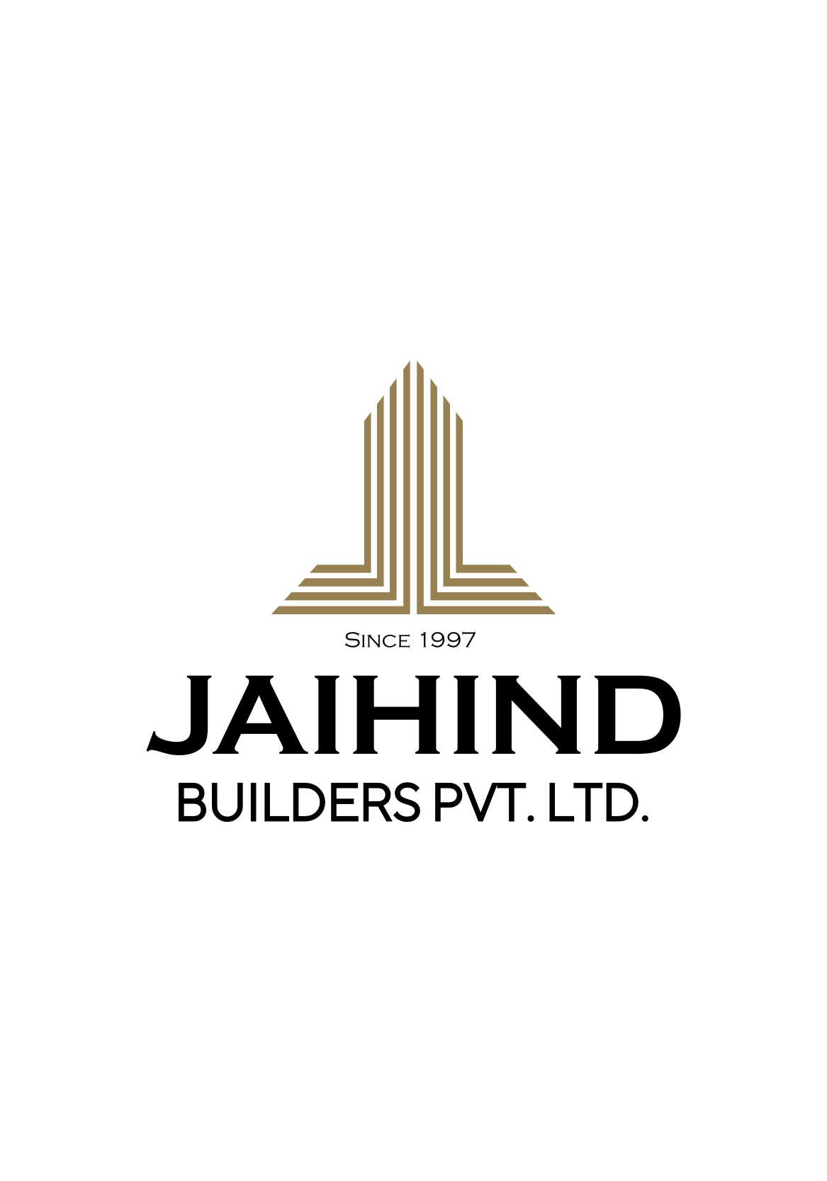
JaiHind Builders
Business domain, business purpose, business, business’ futuristic approach is what we keep in mind while preparing minimalist logos. Jaihind builder’s logo symbolizes how we design the concept by keeping it pretty simple.
The client is in a construction domain that is about to implement all the smart technologies. Hence, a logo was supposed to signify the growth of the company and society as well.
To build the brand identity with a minimalist logo redesign
Approach : We approached the Jaihind builders intending to design and establish the brand identity.
Process : Jaihind builders are planning to get set in the construction field where the competition is already flooded. We came up with a logo that is quite self-explanatory and aligning with their goals and services.
Brainstorming and Conceptualization : After a dedicated brainstorming process, the designer created something that visualized the client’s aim of growing to the heights and simultaneously showcasing the construction industry’s strength.
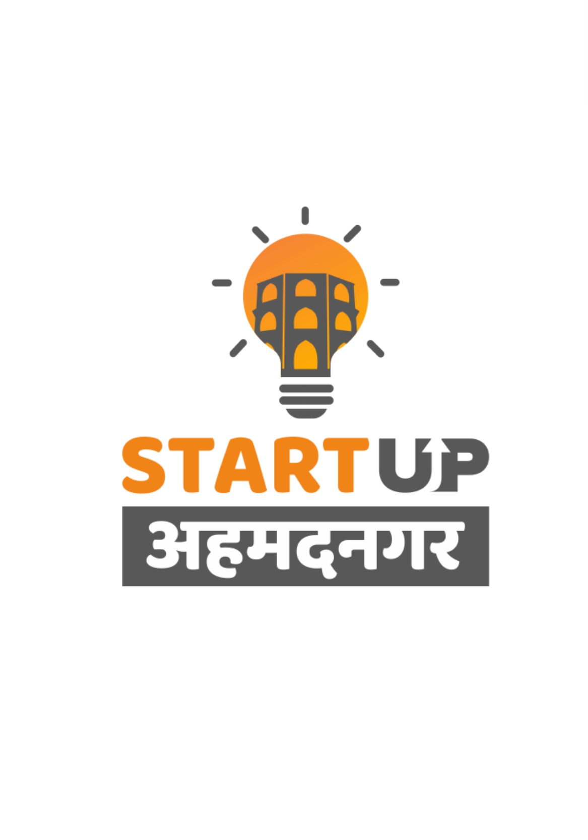
Startup Ahmednagar
Innovation is always recognized with a spark. And any startup is an ignition, is a light. Hence the logo symbolizes the same with brighter colors. The startups in Ahmednagar are encouraged and are promoted across the world. So the recognition of any business ain’t a secret. Our message is loud and clear. And so does the logo signify one. A clear message that implies innovation to achieve legacy.
Objective : To create a brand identity that inspires people to be independent leaders of society.
Approach : The aim was clear, Startup Ahmednagar is an initiative, wanting to help the job seekers and the aspirants to grow independently by creating their startup.
Process : Ahmednagar holds an inspiring history. The Salabat Khan Tomb of Ahmednagar standing tall on the top of the city drew our attention. The monument talk-out-loud about the glory of Ahmednagar. The designer was all set to sketch the brand identity with a touch of historical pride. Not forgetting the creative idea behind the initiative of StartupNagar.
Brainstorming and Conceptualization : After brainstorming, the logo concept combined pride and creativity through a bulb symbol representing ideas and heritage. The orange highlights a “new start,” while the minimal “UP” reflects growth. “Ahmednagar” in Devanagari adds a native, emotional touch..
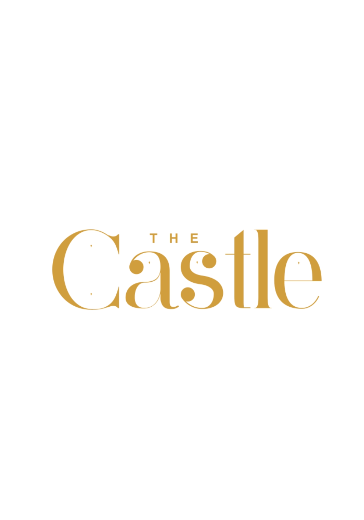
The Castle
The logo redesign embraces simplicity to reflect elegance and charm. It represents tradition, culture, and authentic cuisine—clear, minimal, yet impactful—enhancing the hotel’s brand with a refined, luxurious identity
Approach : We approached The Castle, the renowned restaurant in Ahmednagar, intending to redesign and recreate the brand presence.
Process : The Castle is a lavish and renowned restaurant in Ahmednagar. So our designers created a logo that imparts the feel of lavishness and tradition.
Brainstorming and Conceptualization : After a dedicated brainstorming process, the designer tried creating a symbol that displays the product icon including the brand name in a minimal way. The design was a perfect equation of traditionalism and the lettering of the brand represents simplicity.The symbol represents how iconic and yet simple the brand is
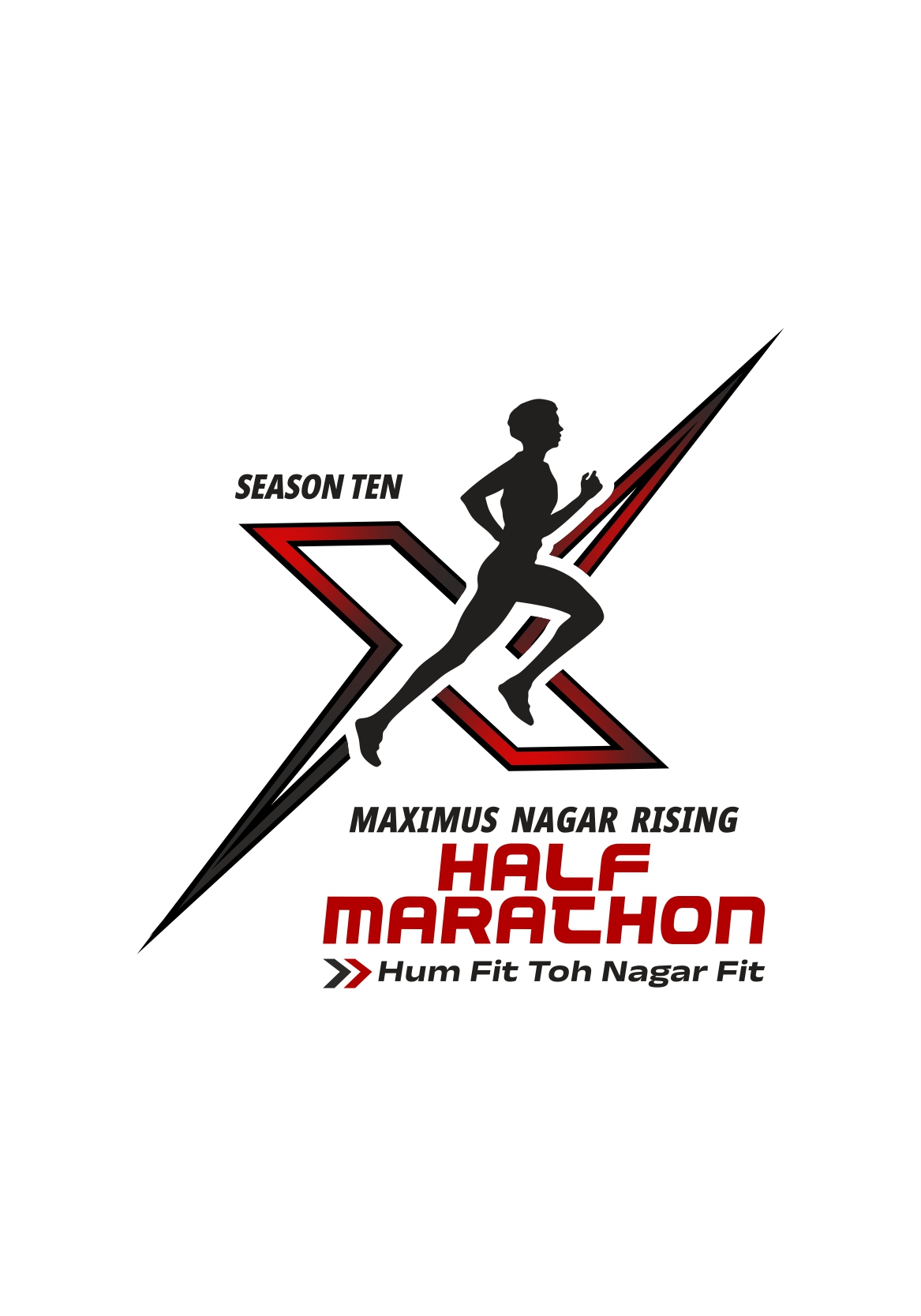
Nagarrising
Nagar Rising Half Marathon is an annual event in Ahmednagar supporting World Cancer Day and promoting “Celebrating Health.” The logo symbolizes health, victory, and encouragement for active participation in sports.
Objective : To create a platform for encouraging the youth to participate in enduring events.
Approach : We approached the Nagarrising community to collaborate on the great idea for good purpos
Process : The brainstorming session started by understanding the purpose behind the event. The expectations were to have a logo that is self-explanatory and inspiring. The relative touch was needed to motivate youth.
Brainstorming and Conceptualization : After understanding all the requirements and knowing the concerns, our designers brainstormed to come up with the design that tells the brand purpose out loud. And at the same time is quite clean and neat to understand
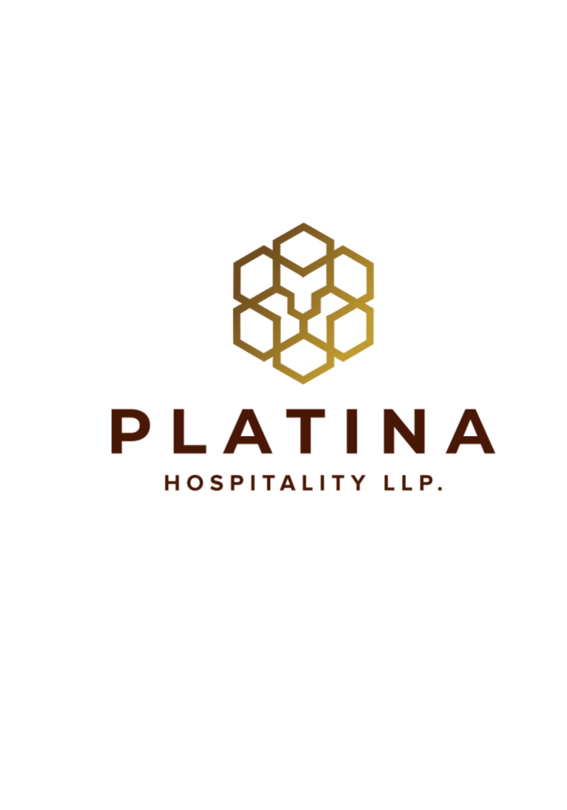
Platina
Platina aims to build a premium, elegant identity for its hospitality brand. The logo is simple yet impactful, reflecting richness, sophistication, and refined quality.
Objective : To create a premium identity for Platina Hospitality, a parent company of other premium hospitality domains.
Approach : We approached the Platina identity intending to create a symbol that expresses the leadership of Platina in the field of Hospitality.
Process : It started with brainstorming and analyzing the client’s vision behind the logo. As they expected modernization, with a touch of simplicity, expecting it to be creative, fresh, and simple. The client expected a color palette that corresponds to their vision of the brand image.
Brainstorming and Conceptualization : After understanding the brand’s USPs and values, the designer began with pencil sketches to visualize ideas and communicate them clearly. The final logo features a hexagonal symbol with a subtle lion face in negative space, representing strength, power, leadership, and royalty.
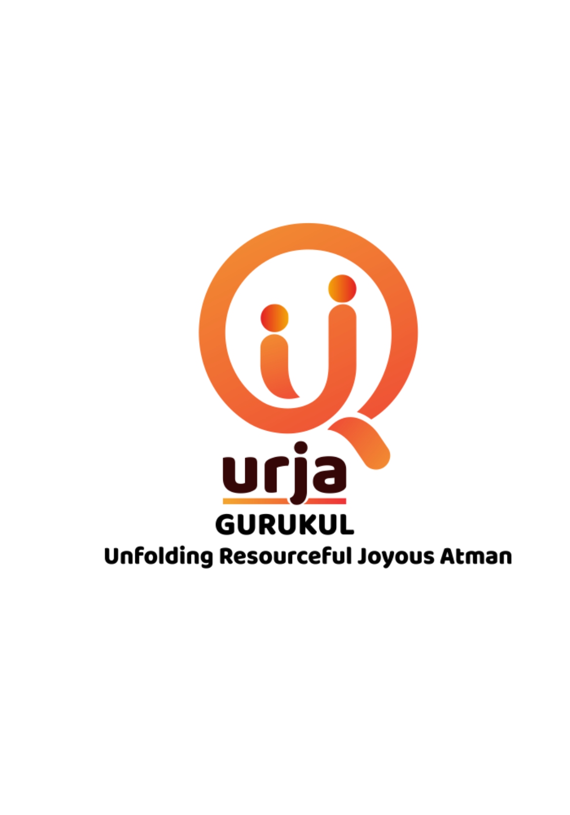
Urja Gurukul
Urja Gurukul focuses on early identification of a child’s interests and supports holistic development through smart learning, nurturing creativity, independence, and self-expression.
Objective: To impart a strong and impactful visual identity.
Approach: We approached Urja Gurukul with a concern towards the existing schooling system.
Process: Our team explored multiple concepts and iterations before finalizing the design that best aligned with the brand values.
Brainstorming and Conceptualization: Understanding the purpose and values, we aimed for an innovative yet meaningful design. The final concept represents a guru and shishya with a modern and friendly visual approach, reflecting a contemporary Gurukul system.
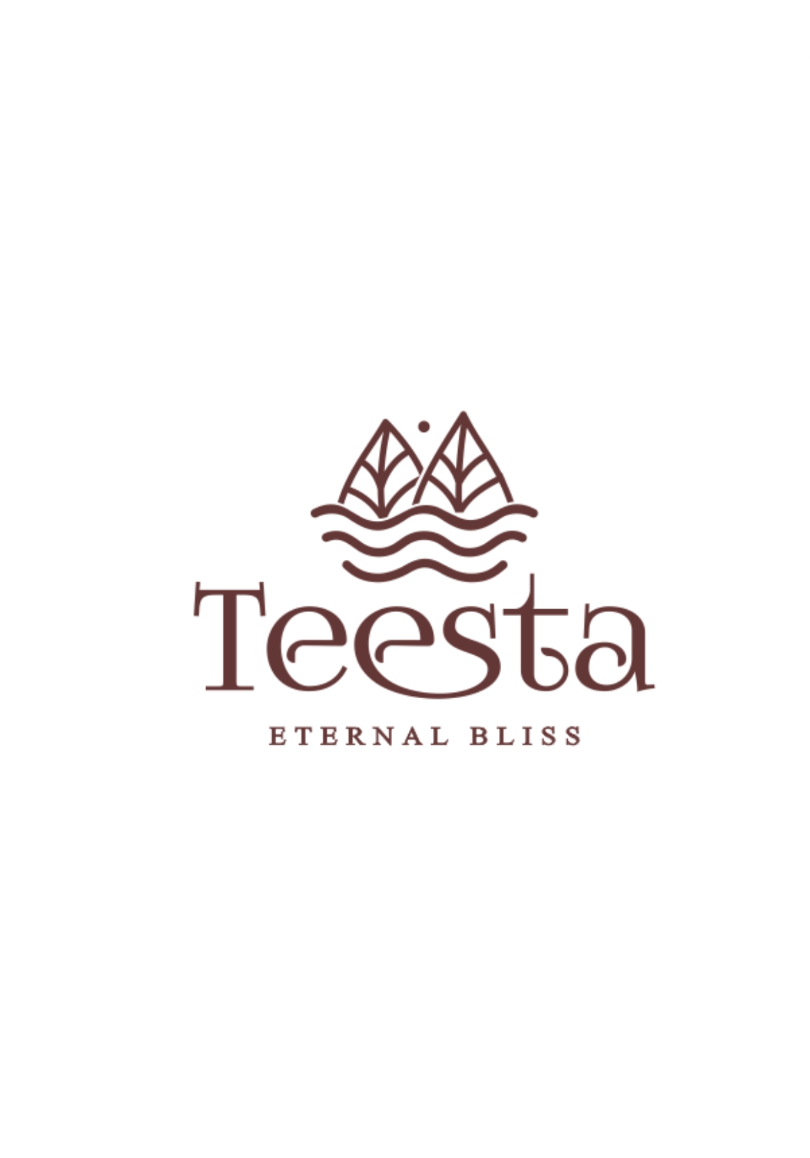
Teesta
Teesta is the brand that displays luxury and nature, together. We approached the Teesta identity intending to create a symbol that expresses purity, the bliss of nature, and a sense of luxury associated with it. The logo was expected to nature at the purest form binding the knot luxury. And the design that we came up with, displays both – luxury and nature, together.
Objective: Express the brand identity that displays luxury and nature, together.
Approach: We approached the Teesta identity intending to create a symbol that expresses purity, the bliss of nature, and a sense of luxury associated with it.
Process: It started with brainstorming and analyzing the client’s vision behind the logo and the brand name. The brand name is Teesta which is known to be the purest Himalayan river. So the brand logo was expected to reveal the purity of Teesta bringing it closer to nature.
Brainstorming and Conceptualization:After understanding the client’s vision, the design captured nature through a flowing wave for the Teesta river, leaves symbolizing greenery, and the sun representing energy and life—all in a single, cohesive logo.
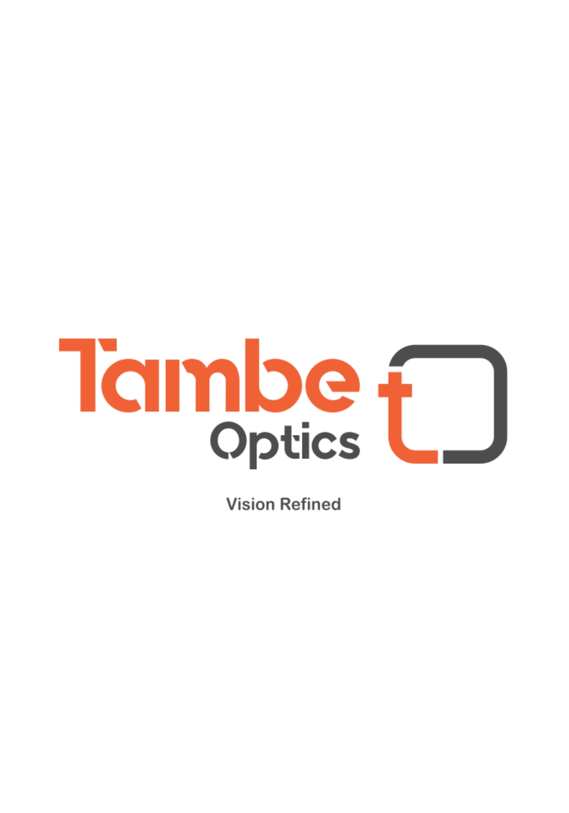
Tambe Optics
Tambe Optics underwent a brand revamp to create a fresh, minimal, and self-explanatory logo. The redesigned identity is clean, modern, and clearly represents the brand.
Approach: We approached the Tambe Optics intending to redesign and recreate the brand identity.
Process: Tambe Optics offers a wide range of eyewear and accessories, with a focus on a minimal logo that highlights the brand name, supported by sketches aligned with its services.
Brainstorming and Conceptualization:After brainstorming, a minimal symbol combining optical elements with the initials “T” and “O” was created. Paired with the brand name, it forms a clear and complete brand identity.